Register now to view prices, save favorites and place orders!

The Palette of Emotions: How Color Influences Guest Experience in Hotels

Posted by Omland 11/08/2023 0 Comment(s)

The Palette of Emotions: How Color Influences Guest Experience in Hotels


Step into any hotel lobby, and you'll notice a deliberate choice of colors adorning the walls, furniture, and decor. From tranquil blues to vibrant yellows, hotels strategically utilize color to influence the emotions and experiences of their guests. The palette of emotions evoked by these hues plays a crucial role in creating a welcoming and memorable stay.


In this article, we delve into the fascinating world of color psychology and explore how different hues impact guest experience in hotels. Drawing on the expertise of interior designers and psychologists, we examine the effects of colors on relaxation, mood, and even appetite. Discover how muted tones promote calmness and serenity, while bold shades stimulate energy and creativity, shaping the ambiance of hotel rooms, dining areas, and communal spaces.


Through a deep dive into the science behind color perception, we uncover the secrets to creating a harmonious and inviting atmosphere that resonates with guests. Join us as we explore the innovative ways hotels are harnessing the power of color to enhance guest satisfaction and leave a lasting impression. Whether you're a hotel owner, manager, or simply a curious traveler, this article provides valuable insights into the art of color selection in the hospitality industry.


Key Takeaways:


  1. Color Psychology Matters:

    1. Different hues evoke specific emotional responses, influencing guest experiences and perceptions within hotels.

  2. Warm Colors Energize:

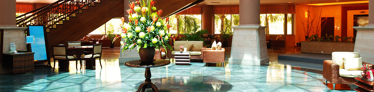
    1. Reds, oranges, and yellows create vibrancy, energy, and social interaction in spaces like lobbies and restaurants.

  3. Cool Colors Relax:

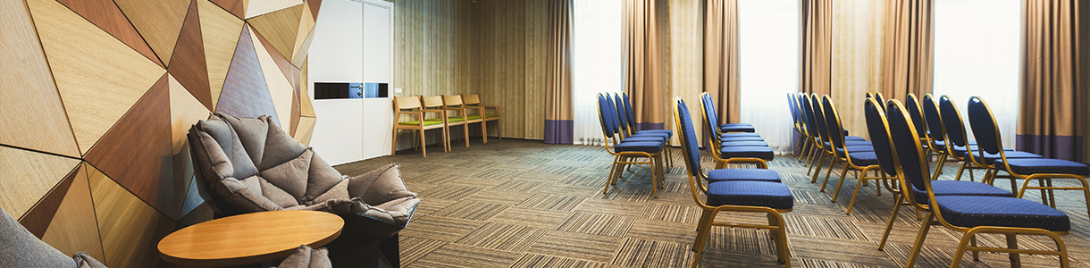
    1. Blues, greens, and purples induce calmness and tranquility, making them ideal for guest rooms and spa areas.

  4. Neutrals Provide Balance:

    1. Beige, gray, and white offer a timeless canvas, promoting relaxation and sophistication in hotel design.

  5. Accents Add Flair:

    1. Thoughtfully placed accent colors amplify visual interest, creating unique atmospheres and enhancing memorable experiences.

  6. Color Trends Influence Design:

    1. Nature-inspired and bold color trends shape contemporary hotel aesthetics, reflecting connection and uniqueness.

  7. Effective Case Studies:

    1. Hotels like Ace Hotel and Icehotel showcase successful color utilization to craft inviting and unforgettable guest experiences.

  8. Omland Hospitality's Role:

    1. With over 20 years of experience, Omland understands the significance of color and offers a diverse range of products, including customizable choices like drapes, to enhance guest satisfaction and create lasting memories.


The Psychology of Color


Color has a profound effect on our emotions and behavior, and this is no different in the hospitality industry. The psychology of color is a complex field that studies how different hues can elicit specific emotional responses. For example, warm colors like red, orange, and yellow are known to evoke feelings of excitement, energy, and happiness. On the other hand, cool colors such as blue and green are associated with calmness, relaxation, and tranquility.


How Color Influences Emotions

The impact of color on our emotions is deeply rooted in our evolutionary history and cultural conditioning. Certain colors have been shown to trigger specific emotional responses universally, while others can vary based on personal experiences and cultural backgrounds. For instance, red is often associated with passion and love in many cultures, while in others it may symbolize danger or anger.


In the context of hotels, understanding how color influences emotions is crucial for creating the desired atmosphere and guest experience. The use of warm colors in hotel design can stimulate feelings of warmth, friendliness, and excitement, creating an energetic and vibrant ambiance. Conversely, cool colors can help guests feel calm, relaxed, and refreshed, making them ideal for spa areas or rooms meant for rest and rejuvenation.


The Impact of Color on Guest Experience


Color has a significant impact on guest experience in hotels, influencing everything from first impressions to overall satisfaction. When guests enter a hotel, the color scheme sets the tone for their stay and shapes their initial perception of the space. The right combination of colors can make guests feel welcomed, comfortable, and at ease, while the wrong choice can create a sense of unease or discomfort.


In hotel rooms, the color of the walls, bedding, and furniture can greatly influence the quality of sleep and relaxation experienced by guests. Soft, neutral tones like beige or light gray create a serene and soothing environment, promoting a restful night's sleep. Vibrant colors, on the other hand, can enhance energy levels and creativity, making them suitable for areas like workspaces or communal spaces.


Using Warm Colors in Hotel Design


Warm colors are known for their ability to create a sense of energy and excitement. When strategically incorporated into hotel design, these hues can make guests feel more engaged, welcomed, and invigorated. In common areas such as lobbies and restaurants, warm colors like red, orange, and yellow can help create a vibrant and lively atmosphere, encouraging social interaction and a sense of conviviality.


In hotel rooms, warm colors can be used to add depth and coziness. Earthy tones like chocolate brown or terracotta can create a warm and inviting ambiance, making guests feel at home. However, it's essential to strike a balance and avoid overwhelming the space with intense warm hues, as this can create a feeling of restlessness or unease.


Incorporating Cool Colors in Hotel Decor


Cool colors are widely recognized for their ability to instill a sense of calmness and tranquility. These hues are often used in areas of a hotel where relaxation and serenity are desired, such as spas or guest rooms. Shades of blue, green, and purple can create a soothing and refreshing atmosphere, helping guests unwind and escape from the stresses of everyday life.


In hotel bedrooms, cool colors can contribute to a peaceful and restful environment. Soft blues or greens can evoke a sense of tranquility and promote a better night's sleep. Additionally, these colors are often associated with nature and the outdoors, allowing guests to feel connected to their surroundings and experience a sense of serenity.


The Power of Neutral Colors in Creating a Calming Atmosphere


Neutral colors, such as beige, gray, and white, are versatile and timeless choices in hotel design. These hues provide a blank canvas that can be easily paired with other colors to create a specific mood or ambiance. Neutral colors are often used in hotel rooms to create a calming and relaxing atmosphere, allowing guests to unwind and recharge.


In addition to their calming effect, neutral colors also offer a sense of sophistication and elegance. They provide a sense of neutrality and balance, making them suitable for a wide range of design styles and preferences. By incorporating different textures and patterns, neutral color schemes can be elevated to create a visually interesting and inviting space.


The Role of Accent Colors in Adding Personality to Hotel Spaces


While the main color scheme sets the foundation for the ambiance of a hotel, accent colors add personality and flair to the space. Accent colors are often used sparingly to create visual interest and highlight specific areas or features. These pops of color can be incorporated through accessories, artwork, or even furniture upholstery.


Accent colors can evoke specific emotions or create a particular atmosphere within a hotel. For example, a bright yellow accent wall in a lobby can add a sense of energy and playfulness, while a deep red accent in a restaurant can create a warm and intimate dining experience. When used thoughtfully, accent colors can leave a lasting impression on guests and contribute to a memorable stay.


Color Trends in the Hospitality Industry


The use of color in the hospitality industry is not static but evolves with changing trends and guest preferences. Hoteliers are constantly exploring new color combinations and palettes to create unique and memorable experiences for their guests. Currently, there is a growing trend toward incorporating nature-inspired colors, such as earthy greens, warm browns, and soft blues, to create a sense of harmony and connection with the natural world.


Another emerging trend is the use of bold and vibrant colors to create a sense of energy and excitement. Hotel owners are increasingly embracing unconventional color choices, such as rich purples, deep blues, or striking oranges, to make a bold statement and create a unique visual identity. These vibrant colors can be used as accents or focal points to create a memorable and Instagram-worthy experience for guests.


For a more in-depth look at hospitality color trends in 2023 check out Innvisions blog post here.


Case Studies of Hotels Using Color Effectively


Several hotels around the world have successfully harnessed the power of color to create unforgettable guest experiences. One such example is the Ace Hotel in Palm Springs, California. The hotel's design incorporates a vibrant color palette inspired by the desert landscape, with hues of red, orange, and yellow creating a warm and inviting atmosphere. This color scheme not only enhances the hotel's unique aesthetic but also reflects the region's vibrant culture and spirit.


Another notable example is the Icehotel in Jukkasjärvi, Sweden. This hotel embraces cool colors, with its iconic ice sculptures and rooms carved out of ice and snow. The use of blues and whites creates a serene and ethereal atmosphere, immersing guests in a magical winter wonderland. The hotel's unique design and color scheme have made it a popular destination for travelers seeking an extraordinary and unforgettable experience.


Conclusion: Harnessing the Power of Color for a Memorable Guest Experience


Color is a powerful tool that can significantly impact the emotions and experiences of hotel guests. From warm hues that energize and engage, to cool tones that relax and rejuvenate, the strategic use of color can shape the ambiance and atmosphere of hotels. By understanding the psychology of color and incorporating it thoughtfully into design choices, hotel owners and managers can create spaces that resonate with guests and leave a lasting impression.


As the hospitality industry continues to evolve, color trends will come and go. However, the importance of creating a welcoming and memorable guest experience remains constant. By harnessing the power of color, hotels can create spaces that not only meet the functional needs of guests but also evoke emotions, foster connection, and create unforgettable memories. So, the next time you step into a hotel, take a closer look at the colors around you and appreciate the thought and intention behind their selection.


For over two decades, Omland Hospitality has been a steadfast partner in the realm of hospitality, catering to the evolving needs of the industry. As a dynamic player, we continuously adapt to changing times and trends, striving to deliver the very best. Our commitment extends beyond standard offerings. Recognizing the influence of color on guest experiences, we meticulously curate our product range to include a spectrum of choices that align with contemporary preferences. We even empower our clients to make personalized color choices by offering customizable options, such as drapes in a palette of their choosing. To explore our comprehensive offerings and embark on a colorful journey to elevate your guest experiences, visit our website and discover the realm of possibilities.